
Customize mobile version
The websites are also mobile websites, because these websites are seen on smartphones as well as tablets. For this reason, the mobile version should also be customized. Because the popularity of the mobile devices is increasing more and more. Most of the users use the smartphone or even tablet to google for some things. For this reason, the mobile version should be clear and well structured. Thus, visitors will come to the website not only once, but several times.
Customize mobile version with Elementor
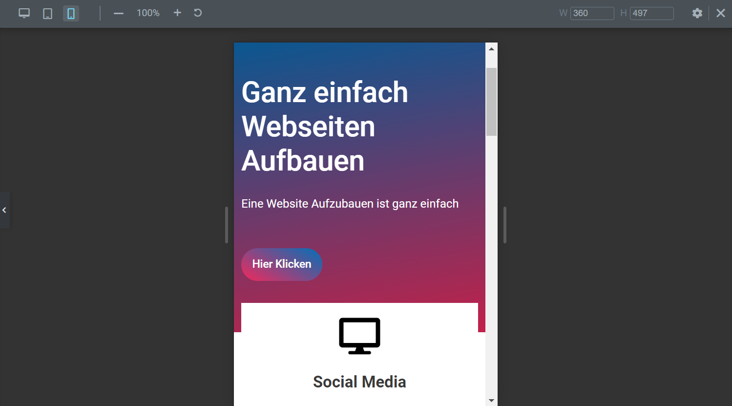
You can customize the mobile version of your website with Elementor. To do this, you first need to click on "edit with Elementor". Now you can find "Responsive Mode" on the left menu bar in the bottom bar. At the top of the layout section you will find three versions, desktop version, tablet version and mobile version.
Click on the mobile version here. Now you can see how your page looks like in the mobile version and adjust it accordingly with Elementor. When adjusting, you should make sure that the desktop version does not shift too much.
In most cases you can adjust the view of the mobile version under Advanced -> Responsive under the mobile switch. This is advantageous if two sections are selected and in the next two sections are also present. If the two images are one below the other as in this example, you can ensure that the text and the image follow first and that the text and then the image are also seen first in the second layout section under Advanced -> Responsive under Invert switch (mobile).
